
Epoch
Background
Epoch was established in 1994 as a clothing store looking to target customers interested in affordable clothing. It has only operated as a bricks and mortar store which was successful until the Covid pandemic hit.
Challenge
With recent concerns surrounding fast fashion and its implications on a social and climactic level, teamed with the company’s recent economic downturn, Epoch needed to make some dramatic changes.
Role
UX researcher / UX / UI designer
Responsibilites
Competitor analysis / user interviews / empathy mapping / card sorting / task and user flows / wireframing / prototyping / user testing
Duration
8 weeks
Note: This is a project part of DesignLab’s UX program. although Epoch is a fictional company, the research is organic and the design is based on real user voices, in combination with mentor and peer feedback.
A New Epoch
Opportunity
Epoch decided to pivot to an online clothing marketplace with a new logo and branding. This would allow users to buy and sell clothing, with the company taking a profit as well as a percentage going to charitable causes.
According to the global report – which was conducted by Thredup with analysis by market research firm GlobalData – the resale market is growing at a rate 11 times faster than traditional retail and should be worth $84 billion by 2030, with fast fashion predicted to be worth about $40 billion.
Solution
We found out that a lot of people didn’t like the idea of buying preloved clothes, they felt it was unhygienic, and well, a bit grosse!
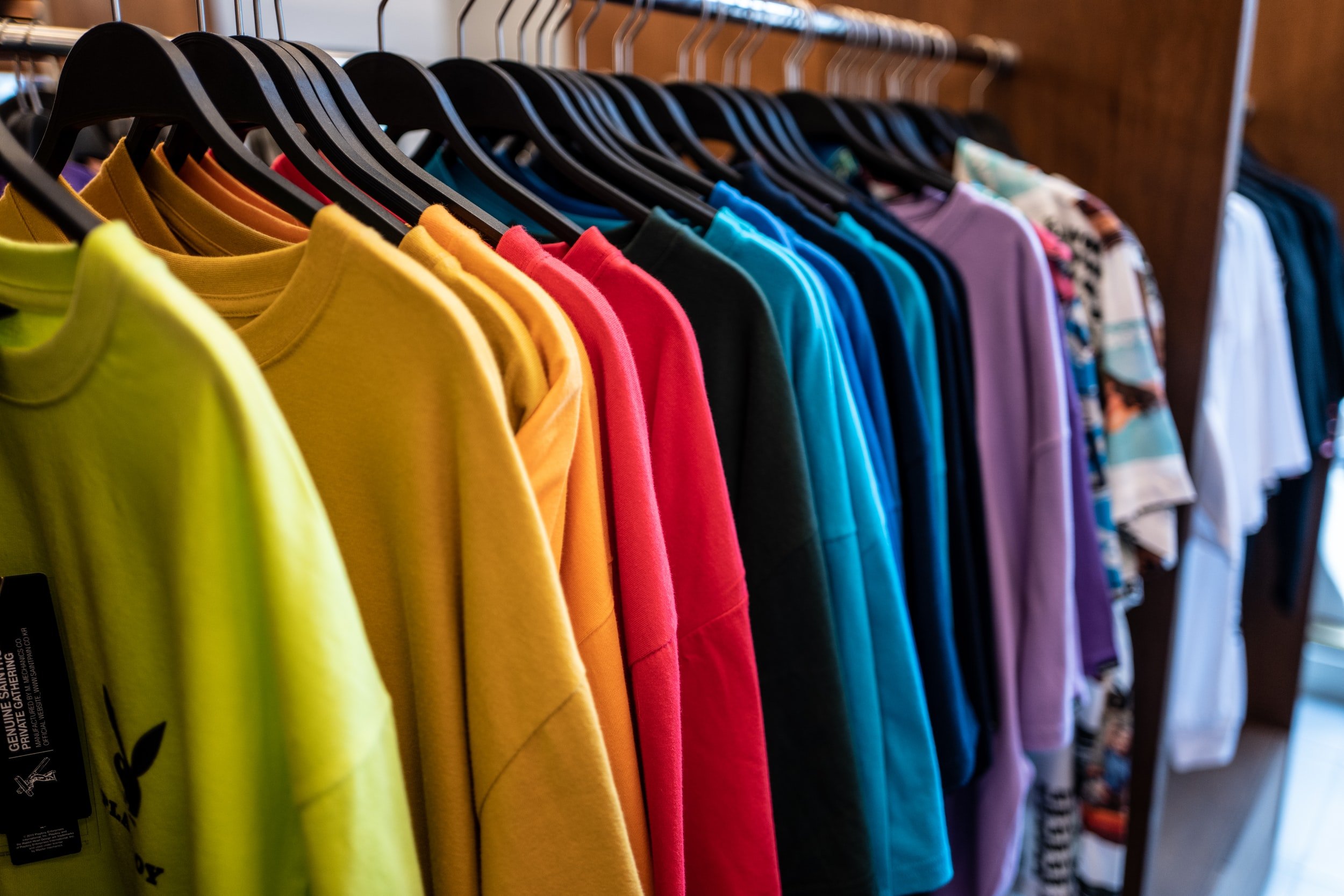
We needed to give the site the look and feel of a new clothing store with the vibrancy and fun of shopping for new clothes. We didn’t want any reminders or references to charity shops or musty vintage clothing stores.

Window shopping
Competitor analysis / user interviews / empathy map
Research Goals
There were a few things I needed to know in order to turn around Epoch’s focus into a clothing marketplace.
What motivates people to buy used clothes
Determine why people buy used clothes online vs in a charity shop
Establish the main features users are looking for in a used clothes website
Competitor Analysis
Who are Epoch up against? Let’s take a look at some similar products on the market. I analysed their websites for functionality as well as design.
Vinted Europe’s biggest online clothing marketplace
Thrift+ Clothing marketplace focusing on luxury brands
Oxfam Charity shop with an online presence with all donations to the cause
Dorothy Perkins One of the cheaper UK clothing brands with a strong online presence
User Interviews
I interviewed 4 key users, most of whom had never sold or bought preloved clothes online. Like many of Epoch’s customers, they had been prevented from visiting physical shops during the pandemic, and were therefore adept at shopping online.
-

Interviewee 1
Age 38
Nurse
Married, 1 child
-

Interviewee 2
Age 38
Campaigns Manager
Married, 2 children
-

Interviewee 3
Age 38
Fundraising Manager
Married, 2 children
-

Interviewee 4
Age 38
Higher Education Professional
Single
Interview Findings
Most participants found the range on clothing websites overwhelming. They always therefore used the search function, rather than browsing.
One interviewee had successfully sold clothes online but felt the categories were restricted and limiting.
Most people didn’t mind online shopping, some much preferred shopping in person so they feel the fabric and thickness of the materials.
Everyone’s online shopping had increased over the past 2 years, either reluctantly, or willingly.
Most had never bought pre-loved clothes, but were open to the idea. One felt she had an ethical obligation to buy preloved clothes. Another felt it was unhygenic.
All the participants gave their old clothes to charity shops, they wanted to profits to go to worthwhile causes.
But what’s the real problem?
Having conducted user interviews, the idea of buying and selling preloved clothes for many is still quite an alien concept. Many people felt that it reminded them of musty charity shops when the clothes had been well worn, smelt musty and weren’t fashionable.
This means that for many people, using such a platform would not be a natural choice. They would still prefer to buy new clothes.
Empathy Map
What did we understand about our user? Well, a lot actually! How they thought and felt, what they saw, heard, said and did, as well as their frustrations and appreciations of online clothes shopping.
The user
Persona development / card sorting / site map development / user flows
Meet our persona, Jessica
Based on the interviews, I was able to create a user persona. Jessica is 38 year old fundraising manager. She would love to buy preloved clothes, but has never taken the plunge. This persona serves as a continuous reminder throughout the design process as to who our primary user is.
Sitemap
After a card sorting exercise, I had some insight into how the site should be arranged. I wanted its organisation to be familiar to Jessica, and similar to that of any other clothing website she already visits.
I focused on breaking down the clothing groups as much as possible, so that she could do a focused shop, finding the items she needed as efficiently as possible. The fundamental difference between this site and any other clothing site, was the ability to sell items as well as message the seller.
How would Jessica navigate the site? Let’s take a look…
Task flow
What was Jessica’s primary goal when visiting Epoch? To buy clothes for her and her kids as quickly and efficiently as possible. I wanted to guide Jessica to reach her goal with as few clicks as a possible. It allows the user to filter items by category, brand and size, in order that she can find exactly what she is looking for in the least number of clicks. Here’s what I came up with.
Building a wardrobe!
Wireframes / Responsive wireframes
Wireframes
I looked at other similar products on the market and analysed their websites for functionality as well as design. I created wireframes whose layout was relatable for Jessica having never used an online clothing marketplace before. I also ensured there was a clear section on the homepage explaining the concept of Epoch since for many it is unfamiliar.
The homepage includes a hero section where users can choose to buy or sell clothes. There is a clear “how we work” section so users fully comprehend the concept. The homepage also outlines the various brands that are sold through the site.
The results page offers various filters for the user, and each search result allows the user to favourite the item. The items also allow for banner text to highlight certain items if and when necessary.
The product page includes a brief summary of the item written by the seller, as well as how many other people are interested in that item. The image thumbnails would allow the user to swap between images and from here the user can directly contact the seller to ask any questions.
Responsive Wireframes
How would the site look on desktop, tablet and mobile? Based on the user interviews, the majority would be more just as inclined to buy clothes on their mobile or tablet as on their desktop computer. It was therefore important that the site was accessible in each format. For mobile, I utilised a horizontal scroll to allow more content on the real estate of the screen.
La Belle Epoque
Moodboard / Logo ideation / UI Kit
Moodboard
In the interviews, a common complaint was that the participants felt too old when visiting certain clothes sites but other more “age appropritate” sites felt boring and fuddy-duddy. Why couldn’t there a be a site for people their age, with clothes that worked for them, but was fun, vibrant and lively? It got me thinking…
I created a moodboard with vibrant colours, patterns and fonts, and used images of women in 30s. The adjectives that sprung to mind were:
Family friendly / Accessible / Comfortable / Fun / Practical / Vibrant
UI Kit
I brought together the Moodboard as well as the logo iterations I had created into a cohesive, relevant UI Kit. I used vibrant colours, clear typography and engaging CTA buttons.
Prototype
Bringing together the user flow, UI kit, wireframes, I created a fluid, intuitive prototype. It brought everything to life!
Testing
User testing / Affinity map / Iterations
The most crucial next step followed: I tested the prototype on users to ensure it actually worked.
I carried out moderated user testing over Zoom in order to determine the successes and frustrations of the prototype.
Overall impressions: vibrant use of colour, fun and clear and intuitive.
Through analysing and synthising the data, I created an Empathy Map which highlighted the successes, pain points and suggested improvements on the homepage, search results page, product page and checkout.
Iterations
As a result of the user testing, I determined that a few crucial changes were necessary in order to effectively complete the task flow.
Different imagary on the homepage to aid clarity of the site
Ability to sort items in search results
Explanation of different delivery methods and costs on product page
Summary
Next steps / Reflections
Due to the limited time frame, I only worked on a few key pages focusing on the buying process. The next steps would be to create user and task flows for a seller, including categtorising items, uploading images and collecting payment. I would also like to delve more into the messaging functionality, since this differentiates Epoch from another ecommerce clothing platform.
As my first UX project, I was really able to explore the UX process including interview best practises, how to synthesize and analyse data, wireframing, prototyping and everything in between!
Although working on a fictional project does have its drawbacks, I learnt a lot and see this project as the start of my UX design journey.
Check out another project ⬇️

Poolside Manor Swimming Pool
A website redesign for an established community pool allowing users to search and book for lessons.