
Poolside Manor
Background
Poolside Manor is a local, well-established independent swimming pool with an excellent reputation in North London. Despite its small size, it runs a vast array of activities for the local community: swimming lesssons, swimming crash courses, day camps, lifeguard and first aid training to name but a few.
Challenge
Its website, although informative doesn’t allow users to browse session times and book classes. This is left to the small reception team who take bookings in person or via telephone to give session times and rely on paper and pen to make bookings. Poolside Manor’s website was ready for an update.
Role
UX researcher / UX / UI designer
Responsibilites
Competitor analysis / user interviews / empathy mapping / card sorting / task and user flows / wireframing / prototyping / user testing
Duration
8 weeks
Note: This is a project part of DesignLab’s UX program and has not been commissioned by Poolside Manor. The research is organic and the design is based on real user voices, in combination with mentor and peer feedback.
Let’s jump in
Opportunity
Many working parents have little time to spend on the phone booking classes and activities. They prefer to do so in their own, often in the evening. Redeveloping the Poolside Manor site to include term schedules and the ability to book and pay for classes and camps, would make the website functional as well as informative, and free up the pool’s office team to focus their attention elsewhere.
Solution
We found out that a lot of the parents booking classes on behalf of their children, wanted (and needed!) to do so in the little free time that they have. This normally didn’t correlate with the pool’s office hours. It was often a struggle to catch a time that worked when the phone lines weren’t jampacked.
We needed to provide Poolside Manor with a site which allowed users to search for and book in their own time. This would give parents time to peruse all the options, cross reference with their own diaries and maybe even their other children’s schedules.
Research
Competitor analysis / user interviews / affinity map
Research Goals
There were a few things I needed to know in order to improve the efficiency of the Poolside Manor website and ensure it was utilised to its full potential.
Understand why users swim at Poolside Manor
Determine how users currently book classes at their local pool
Understand what frustrates users about the current Poolside Manor site
Competitor Analysis
Who are Poolside Manor’s competitors? Let’s take a look at some similar pools that locals may visit. I analysed their websites for services, functionality as well as design.
Oakleigh Park A local pool that focuses on lessons
Better - Barnet Copthall A local authority pool part of a national social enterprise chain
Fusion - Arnos Pool A local authority pool part of a smaller national social enterprise chain
Maqam A small luxury sports and community centre
Barnet Private Swimming Pool A private pool, used purely for 1-2-1 lessons
User Interviews
I interviewed 4 key users, all of whom either currently swim regularly or have swum regularly in the past. All of the users have taken their children to weekly swimming lessons at local pools to gain swimming proficiency.
-

Swimmer 1
Age 44
Medical Doctor; Very regular swimmer
Married, 2 children
-

Swimmer 2
Age 45
Fundraiser; semi-regular swimmer
Married, 2 children
-

Swimmer 3
Age 38
Fundraising Manager; aspiring swimmer
Married, 2 children
-

Swimmer 4
Age 38
Charity Chief Executive; previously very regular swimmer
Married; 4 children
Key Interview Findings
All participants saw the mental and physical benefits of swimming.
Those that did lane swimming appreciated a quiet pool without distractions.
Parents booking their children into sessions were unclear as to how the pool established their child’s swimming level.
All parents wanted their children to be competent swimmers with water confidence. They weren’t looking for them to reach high level swimming.
All parents acknowledged the high costs of swimming lessons.
Parents appreciated that classes with fewer children meant that children learnt to swim faster.
Parents appreciated small size of the pool, its friendliness and community spirit.
I needed to synthsize and analyse the data from the interviews to draw out themes. That’s when I created an affinity map.
Some interesting insights:
Parents wanted to be able to book their children into classes, activities and camps online to allow them to not feel rushed and pressured.
Users wanted to be able to see the pool’s timetable and term dates.
Parents wanted to be able to understand what level their child was at.
So what SHOULD be on the website?
Timetable of events and activities.
Term dates.
Booking of events, classes and camps.
Questionnaire to establish child’s swimming level.
Brief bios and photos of staff and teachers.
The swimmer
Persona development / card sorting / site map development / task flows / storyboarding
Meet our personas, Claude and Angie
Based on the interviews, and following the synthesis and analysis of the data, I was able to 2 create user personas. Claude is 45 year old lawyer with one son. With an intense job, she carves time out for herself by swimming on a regular basis at her local pool. Our other persona, Angie, has 3 children for whom she organises weekly swimming lessons. She wants them to be proficient enough that they can all enjoy the pool without her having to worry. Both personas serve as a continuous reminder throughout the design process as to who our primary users are.
Due to time constraints, I focused only on Angie as a persona since she encompassed a lot of the findings from the interviews. Angie humanised the design process and allowed me to focus in on a targeted solution.
Storyboarding
What was Angie’s current process when she wanted to book swimming classes? What is the ideal? I created 2 storyboards - one for each scenario, outlining the mindset, thought processes and challenges she encountered. This exercise really allowed me to focus on the user, to thoroughly understand her intentions and to concreate on the features that the website needed to include in order to bring the user to the ideal state.
In the current process, after having heard great things about Poolside Manor, she visits the site where she finds a wealth of information. She is however, unable to see class times and book. When she calls up and speaks the team, she realises she needs more information than she has to hand and feels totally overwhelmed. She thinks she eventually finds a good class, but having given her credit card details, feels somewhat uneasy that her information is safe. She is relieved when it is over, but is left feeling exhausted.
In the ideal state, when accessing the site, Angie finds all the information she needs. She cross-references her diary and gets in card details in order to book the class that works for her family. She finishes the process relaxed and at ease, knowing she made an informed decision in her own time.
Establising a Sitemap
Since Poolside Manor offers such a wide range of activities, it was essential that I conducted a card sorting exercise to establish the best information architecture for the site that specifically worked best for our user.
10 international users carried out a card sort to establish how the wide-range of classes and activities should best be organised on the site. As a result 6 main groupings were established:
Free swim
Swimming lessons
Training
Exercise classes
Pool parties
Multiactivity day camps
I could then get cracking establishing the information archicture which utilised these 6 grouping - how would Angie navigate the site? Let’s take a look…
Task flow
Looking back at the user interviews, I created a task flow which allowed the users to reach their goals of finding, booking and paying for classes quickly and efficiently. The user is able to log in knowing that the sytem will have her personal information saved, search for classes through a filtered search and book the chosen class. In doing so, they would pay for the class by either adding their payment details or using those saved on the system. This user therefore is able to book for what they need quickly and efficiently, seeing all the options available to them, and choose the one that suits them best.
Building
Wireframes
I focused first on the homepage deciding on the elements and their order. I used a modular approach to create a low fidelity wireframe which allowed me to play around and focus on the arrangement of the homepage features. I was sure to include features that were important to the users on the homepage.
Using Figma, I created digital screens for all elements of the task flow, focusing my efforts on the slightly more complicated elements such as timetables, schedules, level finder, bookings, payment and members portal. The members portal would allow users to have a number of children ontheir profile, so they could choose which child is attending the class.
The Design Stroke
Moodboard / Logo ideation / UI Kit
Moodboard
In the intial interviews, users described the website as being “pretty outdated” both in fuctionality as well as design. They also felt that the logo needed a redesign since it didn’t reflect the spirit and competency of the pool.
I created a moodboard with blue and yellow tones which give a nod to nature and coastal areas.
The adjectives that sprung to mind were:
Community / Family-friendly / Supportive / Well-eatablished / Teaching / Reputable
UI Kit
I brought together the Moodboard as well as the logo iterations I had created into a cohesive, relevant UI Kit. I used vibrant colours, clear typography and engaging CTA buttons.
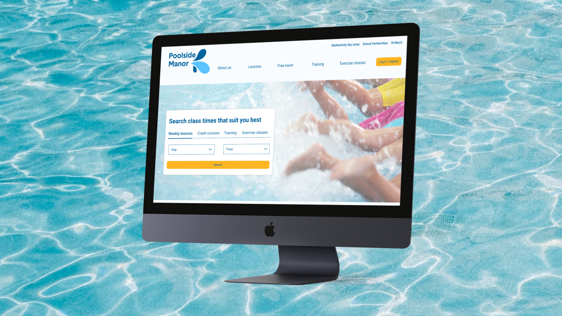
Prototype
Bringing together the user flow, logo, UI kit and wireframes, I created a refreshing prototype that allowed users to view, book and pay for classes through the site. The prototype uses strong, bright imagery to really convey the community feel of the pool. The clear fonts and use of white reflect the transparent nature of water and the ease of use of the site.
Testing the water
User testing / Affinity map / Iterations
The most crucial next step followed: I tested the prototype on users to ensure it actually worked.
I carried out moderated user testing over Zoom in order to determine the successes and frustrations of the prototype.
Overall impressions: refreshing, clear, vibrant.
Through analysing and synthising the data, I created an affinity map which highlighted the successes, pain points and suggested improvements on the homepage, search results, checkout and confirmation pages.
Iterations
As a result of the user testing, I determined that a few crucial changes were necessary in order to effectively complete the task flow.
Clearer and more consistent language on the homepage
Allow more ways for users to complete the task of finding and booking sessions
Move some of the CTAs to more intuitive and potentially less prominent places
Include a shopping basket to allow users to see the sessions they have booked in one cohesive space
Reduce the white space on the checkout page
Summary
Next steps / Reflections
This was a great project to work on since it was a website I have my eye on for a while! As a user of the pool myself, the user interviews were particularly interesting as I was forced to set outside of myself and look at the project objectively.
If I had more time for this project, I would conduct a wider range of user interviews including Poolside Manor office staff and teachers, as well as those who utilitised their annual membership and swam in the evenings. I would focus on the second persona, Claude, to establish how the website can work well for her.
I would delve more deeply into secondary research and look at centres that only offer a few of the activities that Poolside Manor offer. These might include those that offer one-to-one swimming classes; activity camps or membership swimming.
If this project were to be implemented, my next steps would be to design further pages which were not integral to the task flow I designed including the teacher profile, about us and membership pages.
Increasing foodbank donations while grocery shopping
Finding your next book, based on how you’re feeling